
UX DESIGN | DESIGN SYSTEM | VISUAL DESIGN
Membership Website UI/UX Design Case Study
Project Overview
Timeline
Winter - Fall 2022
My Role
UI UX Designer
Tools Used
Figma, Maze, Google Analytics
Privilee is the UAE’s top lifestyle membership app that provides unlimited access to premium hotel pools, beach clubs, gyms, fitness classes as well as exclusive restaurant, bar and spa deals. The ultimate objective for this project was to increase website's conversion by improving user experience.
Project Timeline
The project was divided into three main parts for a better visual representation of the events overview. Starting with the discovery stage all the way to the final product.

Goal
Current's website information structure is confusing and doesn't explain well Privilee's value proposition thus creating a high dropdown rate.
Our goal was to help website users understand Privilee offering so that they trust us and subscribe to the right membership increasing conversion.
My role
My role in this project as a UI/UX designer was to take ownership of the website design, from concept to delivery. My responsibilities included: user research, wireframing, prototyping, usability testing, iteration, and collaboration with the development team.
Design Process
The Double Diamond is a structured design approach to tackle challenges in four phases: Discover/Research, Define/Synthesis, Develop/Ideation, Deliver/Implementation.
Problem

Discovery
For discovery, we defined some initial goals to learn customers’ needs, behaviors, expectations and pain points entering Privilee.ae that we will be able to address on the new website.
What is the value proposition that Privilee promotes?
How people perceive Privilee’s value proposition when visiting the website?
What is the target segmentation or personas?
What do users need to know /to feel to form a decision?
What is the intent users have when they visit the website?
How does users feel about the current journey?
Research Insights
We conducted a user interviews to better understand user's perspective on the product. These are the highlights of the insights we discovered when working through the interview results and feedback.
Word of mouth is the reason how people get familiar with Privilee and its service
People are familiar with the promotional periods and they wait to get a better price
People are looking for more information online about Privilee
80% of visitors access from their mobile devices & 70% of sales come from mobile
Even existing members are looking for trustworthy information in FB group
People feel uncertain about Privilee offering and get in touch for reassurance
Privilee’s offering is perceived wanna be “exclusive” due to the fact that the prices are hidden
When they become members they try to adjust their lifestyle using Privilee
Users Segmentation


Opportunities
01
Allow convinced users to register for Privilee from the app avoiding the lead form
02
Allow users to explore certain features before they use it by understanding their context and provide relevant information within the app. E.g. onboarding strategy
03
Even the users that end up on the website should be able to navigate and find the information they are looking for in order to proceed with subscription
04
Provide relevant information on the right steps of the journey regardless where and how user lands on the website
05
Create excitement by displaying features that the competitors or similar business cannot compete with
06
Allow users to purchase from the website but connect all the dots to provide a smooth end-to-end journey starting from any entry point until a successful registration journey in the app
Previous Website Design

Redesign Process
User Flow
To better understand how we would construct the core experience for Privilee, we designed a user flow. This helped us focus more on the experience and needs of the user and less so on the details that we would solidify later on. It also allowed us to communicate the entries and exits more clearly so we would have a better understanding moving forward.

Wireframes

Design System

Mobile First Approach

Homepage
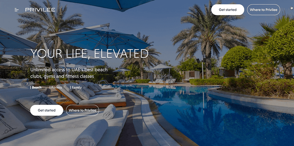
Redesigned Privilee Homepage and Category Landing Pages are now clearly state its value, main features and exclusive benefits. To make things easier for the user we've also added a "How To" section explaining how Privilee membership works.
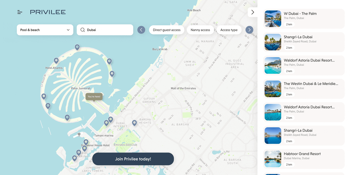
Map View
The previous website had a brochure with venue information in PDF format. We've now introduced an interactive map which allows users to filter through the venues, view their location and all necessary information making it a quicker and easier experience.
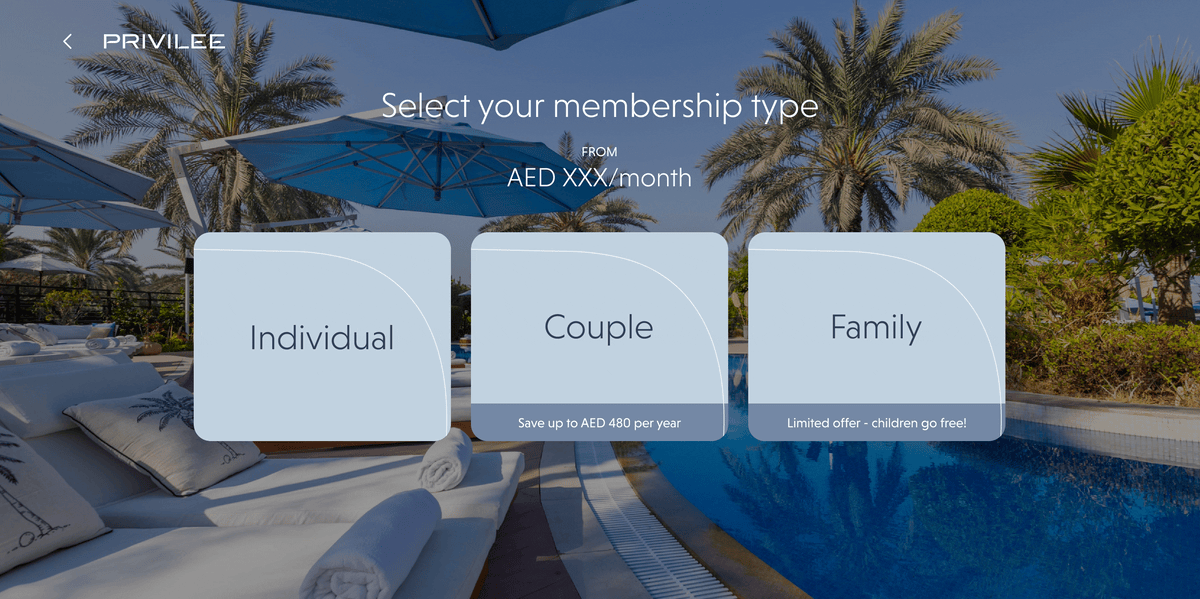
Plans & Pricing
We've now made plans & pricing easily available through the lead form becoming more transparent and showing the real value of the membership.
Other Pages
